14 Interactive Dashboards

14.1 Purpose
The goal with an interactive dashboard is often not “tell a story” as much as it is to “enable the user to explore the data for themselves.” But that doesn’t mean we send them out into the vast reaches of the universe all alone! They can get lost in the data or miss valuable insights if we don’t design an effective dashboard.
Here’s an example of an interactive dashboard that allows users to explore purchase card transactions made by municipal employees of the City of San Jose. Purchase cards (credit cards) linked to corporate or government accounts are an important tool that streamline travel and expense reports, but require oversight to keep spending under control.

You can try it out here. Is this dashboard perfect? Certainly not. (For one thing, it’s not even finished yet…). But it’s pretty good. The exact parameters of the dashboard would need to be determined by the end-user…probably the finance staff or department managers.
14.2 Dashboards Defined
A dashboard is a centralized tool to concisely display key performance indicators (KPIs), metrics, and information to help users understand their data. Depending on the context (and who the users are), it is often useful to push the dashboard to another location to “meet the users where they are.”
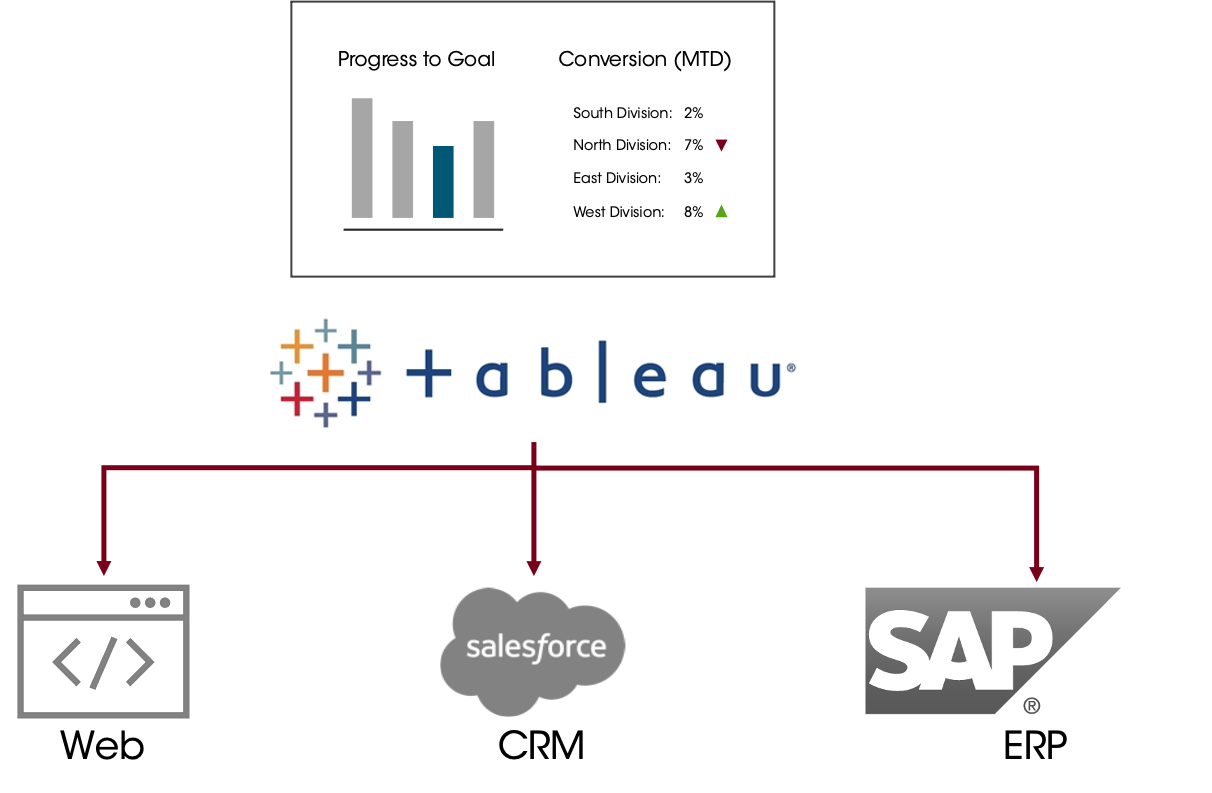
This might mean pushing it onto a website (e.g. in the case of a news organization or non-profit doing some kind of data journalism), or into the CRM or ERP for a firm’s users.
14.3 Common Tools
There are a variety of tools commonly used to build dashboards. Which tool you use will depend on your firm, security and pricing requirements.
…and many more
Even Microsoft Excel can be used to build powerful dashboards. It’s not about the tool so much as intentional design and thought about how the user will interact with the data. The one rule that I argue is always true is that just buying a license for a piece of software will not fix a firm’s problems. A particular tool (and there is usually more than one good option) is only a tool and must be implemented as part of comprehensive solution to an underlying problem.
14.4 Guidelines for Dashboards
There are no hard-and-fast rules for dashboards. Generally, though:
Dashboards should be customized for specific business needs
Keep it concise with a small number (maybe 3-10) of metrics
Interactivity (e.g. with filtering) can support users doing their own exploration and seeing specific things they need (which might mean you can leave something off…don’t need to replicate views)
Designed to be accessed by “non-data” people
A good dashboard will not answer every question a user might have. Adding more data points and options can make it more complicated, slowing everyone down and making it overwhelming for less technical users.
14.5 Visual Layout
Effective design will make the dashboard more usable, reducing the time-to-insight.
Keep it simple. Only include the important stuff.
You have 5 seconds to “hook” the reader, 15 seconds for them to understand what they’re looking at. If they are confused for the first 30 seconds, the dashboard is not effective.
Key metrics should be big, bold, and immediately interpretable.
14.5.1 F and Z Scanning Patterns
Two common patterns that people adopt when looking at something are “F” and “Z” scanning patterns. They look to the top left corner, scan to the right, and then adopt one of the two patterns.
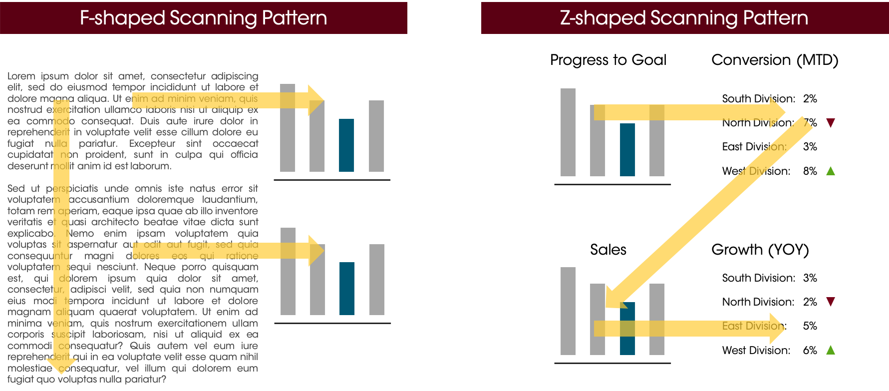
A key takeaway is that the top left corner reliably gets seen first, and gets more attention than anywhere else on a page (on average). Put your key, compelling takeaways here. Alternatively, use this space to orient the reader to what they’re looking at.
14.5.2 Negative Space or White Space
In visual arts, negative space is the space not occupied by the subject (e.g., the space around the face in a portrait). Similarly, in visual design and typography (which is commonly black-ink-on-white-paper) the space not occupied by text or ink is called white space.
This negative space is crucial to helping the reader make sense of the images on the page. It keeps things from getting cluttered, and gives work a “classic” look, so leave sufficient margins and space between elements on the dashboard.
Consider keeping the background white; if users print out the dashboard, backgrounds often don’t print well. Additionally, if printed on a laser printer, it’s much harder to write on the margins with a pen or pencil.
14.5.3 Colors
Limit the number of colors on a dashboard. Keep it to 2-3 colors, potentially coordinated with the brand. If you’re working for a client, ask them for the brand style guide!
14.6 Dashboard Design Process
Design the dashboard for a target audience. What matters to them? What questions are they trying to answer? There should be an iterative process to design a dashboard.
Here is one process that you could use.
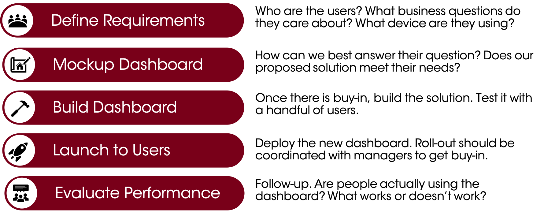
14.6.1 Define Requirements
First, define the requirements for the dashboard. This should be a collaborative meeting with the users (or representatives from the group) to understand what they need to get out of it.
Some questions to ask are:
Who are the users?
What business question(s) need answering?
What are they using now to answer this question? Are there reports/graphs that are helpful? What is the shortfall driving the need for the dashboard?
What is the data source? How will the data be accessed? Are the users authorized to access this data?
What device are they using/how will they view the dashboard (many sales representatives aren’t given computers by their companies and only have iPads or phones!).
14.6.2 Mockup Dashboard
Before you do any coding, you should develop a plan for what you’re going to build. For shorter projects, this may just be a sketch on paper or on a whiteboard. If this is for a client, consider a mockup (eg, in Visio, Powerpoint, or Adobe Illustrator) to get their buy-in. An example of a sketch for a dashboard is below.

Changes can happen, and it’s expected that as you look at the data, you’ll adjust how you lay things out. Notice that this sketch has some edits and notes on it. The sketch is just intended to help you be deliberate about your dashboard and to gain consensus among the team before valuable time is spent coding and building.
14.6.3 Build Dashboard
Next step is to build the solution. Test it with a handful of users, and get frequent buy-in/approval if it is a large project.
14.6.4 Launch to Users
Deploy the new dashboard. Change management is important, because any change is hard. Ideally, roll-out should be coordinated with the managers of the team getting the dashboard. Doing a demo and training session should be considered.
Explain “what’s in it for me?” to the users. Why should they bother to use the dashboard?
14.6.5 Evaluate Performance
Follow-up after launch. If you get no feedback, it’s either perfect or people aren’t using it. Consider having some live feedback sessions, doing surveys, doing follow-up meetings etc.
If you can track stats, check the usage statistics.
In the future, don’t be afraid to tell people, “No, we’re not building that dashboard because we built that before and nobody used it!”