6 Intro to ggplot

6.1 Why ggplot?
R comes with a default plotting package, but the ggplot package is very powerful and (in my opinion) much more intuitive. ggplot is a package developed by Hadley Wickham; the work began while he was working on his PhD thesis in statistics. It’s free, widely used, and is well-supported.
6.2 Resources
These course notes are not intended to be a complete guide to ggplot2. There are excellent resources online, including:
- The ggplot2 website which also includes this excellent cheatsheet
- ggplot2 book by Hadley Wickham, Danielle Navarro, and Thomas Lin Pederson
We’ll walk through some basic examples, though. There are also examples of many other graphs throughout the notes. It’s important to know how to tweaak and adjust your code, using search engines and help files to learn how to do specific things.
6.3 ggplot2 vs Base R
First, let’s compare ggplot2 to the Base R graphics package. (There is another package called lattice but it’s much less popular.)
### Compare the capabilities of base R vs ggplot
library(tidyverse)
library(lubridate)
library(scales)

# Suppress summarise info
options(dplyr.summarise.inform = FALSE)

# Load booking data
bookingdata <- read_csv("hotel_bookings.csv")

# Make a quick scatterplot with the base R package
plot(bookingdata$adr, bookingdata$total_of_special_requests, type = "p")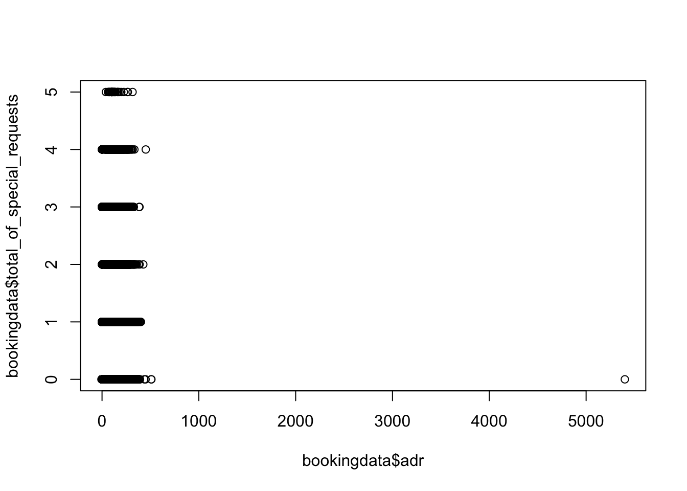
# Now make a quick scatterplot with ggplot
bookingdata %>%
  ggplot(aes(x = adr, y = total_of_special_requests)) +
  geom_point()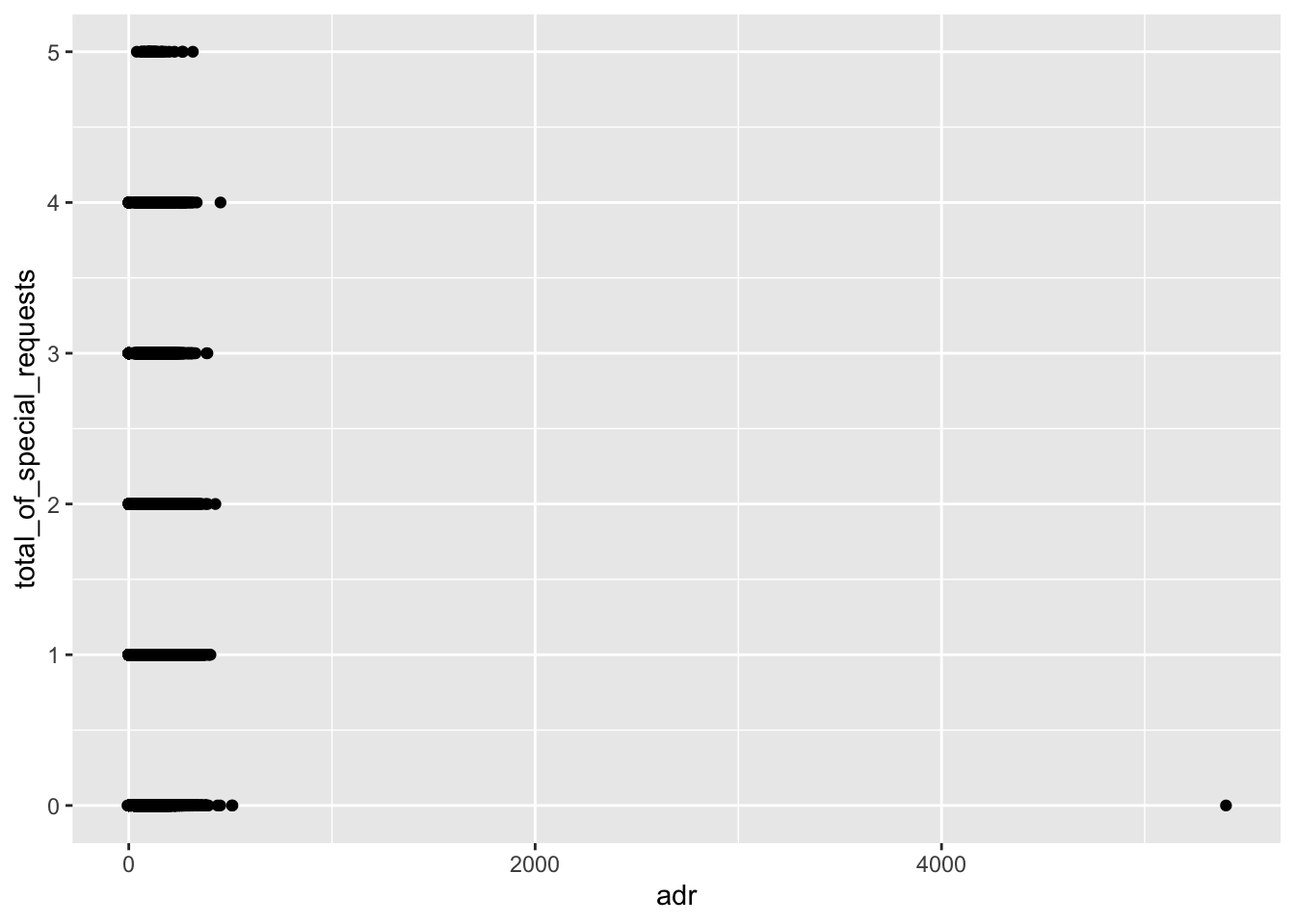
The two plots aren’t that different, but the syntax is quite a bit different. Also, the appearance of the ggplot graph is much nicer, which hints that it’s maybe more advanced.
ggplot2 is much more flexible and powerful than the Base R plots package though. Notice that outlier, with an adr (Average Daily Rate) of nearly $6000? Sure would be nice to quickly filter that out. And clean up the labels. And…and…and…
You can probably do most things in the Base R plotting functions. But it’s not as flexible, or powerful, or common.
6.4 Grammar of Graphics
The grammar of graphics is an idea that was originally proposed by Leland Wilkinson. It breaks down the different components of a visualization to build it from the ground up using layers.
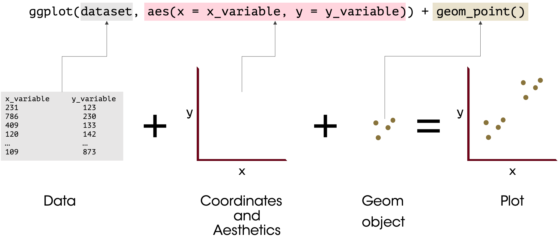
Different software packages apply the different “grammar of graphics” components in different ways. We always start with the data (after all, you can’t plot without some data!).
Next, we set up a coordinate plane (which will be called by the aes command, which can either go in the ggplot or the geom_*.
Then you can introduce statistical transformations with stat_summary.
Then, add the geom_* layers, which will bring in the points, lines, shapes, etc.
Then, bring in any transformations of the scales (e.g. to currency or dates), as well as facets.
When you’re building a plot, generally start with the key elements and make sure it’s producing what you want before adding further layers (e.g. plot the points before adding labels).
6.5 Themes
The theme() layer lets you control many aspects of the appearance of a graph. There are a number of pre-developed themes you can use, or you can define your own.
The ggthemes package includes some additional themes that you may want to try out, including theme_tufte() which is similar to that used in Tufte’s work, and theme_economist() which is (surprise) like the graphs used in The Economist.
### Plot the same line graph with different themes
# Load ggthemes package
library(ggthemes)

# ggplot default theme
base_graph <- bookingdata %>%
  group_by(arrival_date_year, arrival_date_month, hotel) %>%
  summarise(bookings = n()) %>%
  mutate(booking_date = dmy(paste0("01", arrival_date_month, arrival_date_year))) %>%
  ggplot(aes(x = booking_date, y = bookings, color = hotel)) +
  geom_line() +
  scale_color_manual(values = c("blue4", "darkred"))+
  scale_x_date(labels = date_format("%b-%Y"), breaks = date_breaks("4 months")) +
  labs(x = "Month",
       y = "Total Bookings",
       color = "Hotel")

# Plot the graph with the default ggplot theme
base_graph +
  labs(title = "Default Theme - Total Bookings by Month")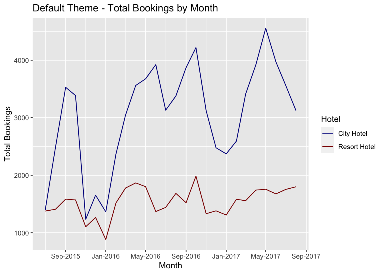
# Use the ggplot theme_bw
base_graph +
  labs(title = "ggplot theme_bw - Total Bookings by Month") +
  theme_bw()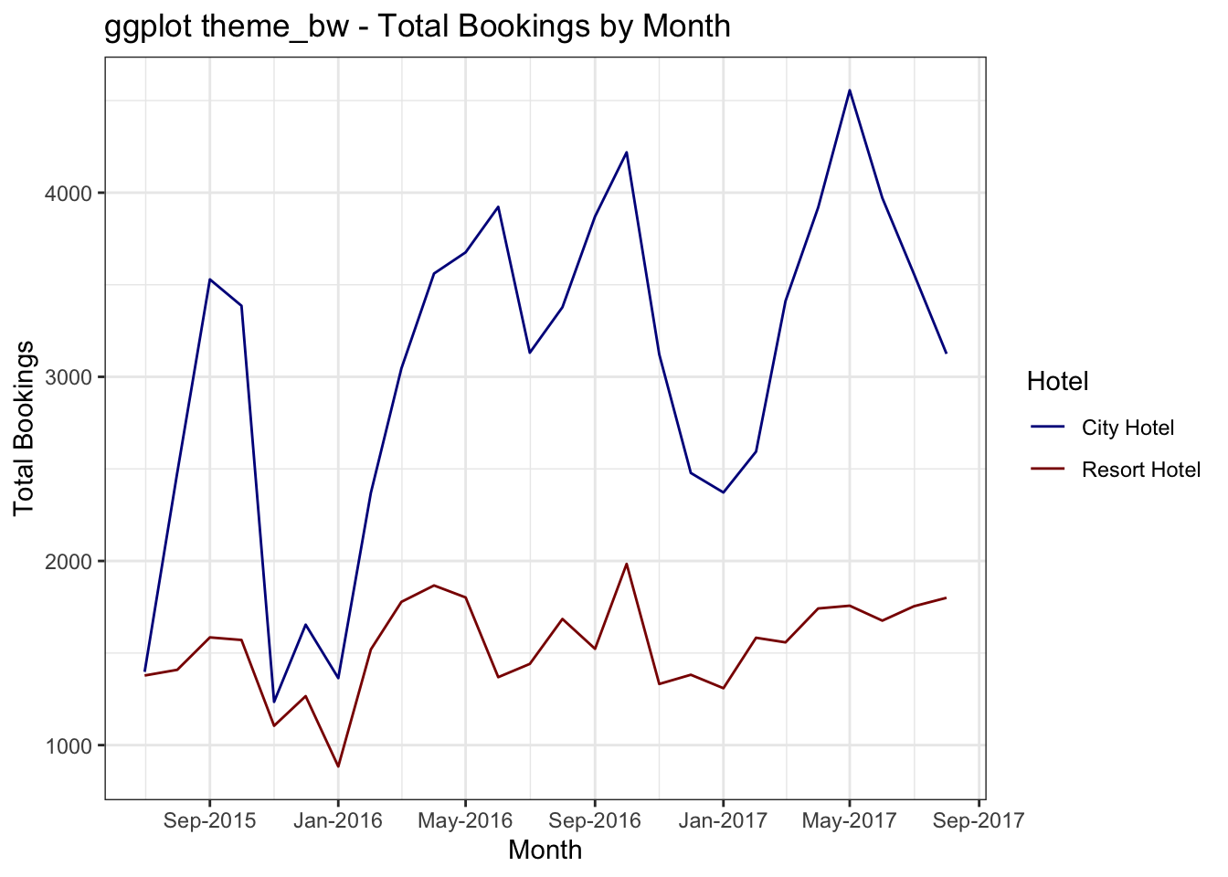
# Try the ggthemes tufte theme
base_graph +
  labs(title = "GGThemes theme_tufte - Total Bookings by Month") +
  theme_tufte()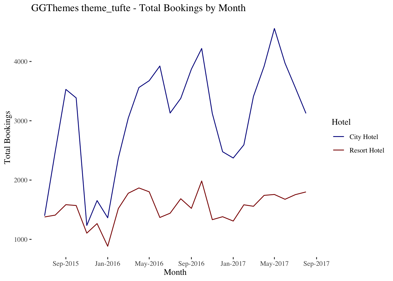
# Try the Economist theme
base_graph +
  labs(title = "GGThemes theme_economist - Total Bookings by Month") +
  theme_economist()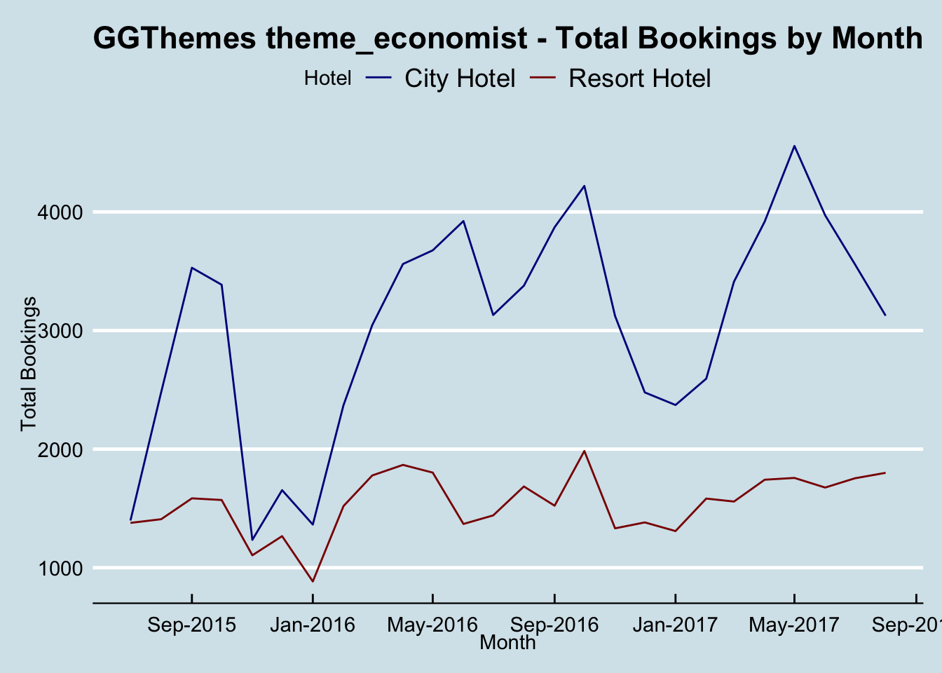
Other themes that work well are theme_minimal and theme_bw. You can also specify any element yourself to adjust a pre-existing theme, or to create your own theme.
6.6 Esquisse - a ggplot GUI
Most of the interactions we have with R are by coding, but the esquisse package offers a graphical user interface for ggplot. You can either create a finished graphic or get a jump start on the code and then refine it.
Trivia: esquisse means “sketch” in French.
As with any other package, the package page on the CRAN site is a good place to start. I’ll show a brief overview of how to use the package here.
# Load the esquisse package
library(esquisse)

# Launch esquisse
esquisser()
When you launch esquisse, it will ask which dataframe you want to look at. If you have already loaded data into R, look at the </> Environment.

In this case, I’ll select the bookingdata.

Then we’re presented with an interface that lets us select all of the aesthetics, attributes, labels, stats, geoms, etc.

We can adjust a range of settings. It’s pretty intuitive (refer to the rest of the course for when you might want to make one choice vs another).

Finally, we can copy the code to the clipboard or insert it into our script, either as the final graph or to fine tune through the code.
