8 Distribution Analysis

We should always assess the distribution of a numerical variable, look at the dispersion, and check for outliers. Of course, it’s always good to start with a table. Let’s look at the mean and median of the Average Daily Rate (price) charged by the two different hotels in the hotelbookings dataset.
# Load booking data
bookingdata <- read_csv("hotel_bookings.csv")

# Load the Anscombe's Quartet data
anscombe <- read.csv("anscombes.csv", header=TRUE)
anscombe$id <- NULL

# Create a table of mean and median ADR (price) by hotel
bookingdata %>%
  group_by(hotel) %>%
  summarise(`Mean ADR` = dollar(mean(adr)),
            `Median ADR` = dollar(median(adr))) %>%
  rename(Hotel = hotel) %>%
kable()| Hotel | Mean ADR | Median ADR |
|---|---|---|
| City Hotel | $105.30 | $99.90 |
| Resort Hotel | $94.95 | $75 |
8.1 Histograms
Histograms allow you to assess the distribution of a numerical variable. Histograms display the frequency (count) or proportion (percentage) of observations in each bin. While you can put more than one group on a histogram (and have two colors of bars) histograms seem to work best when there is just one group.
### Create a Histogram

# Format for a break in the line of a title/label using regexps
# It will replace a forward slash (/) with a line break
addline_format <- function(x,...){
    gsub('\\/','\\\n',x)
}
# Alternatively, just add "\n" to insert a line break

# Plot the Histogram
bookingdata %>%
  filter(adr<1000) %>%
  ggplot(aes(adr)) +
  geom_histogram(fill = "#00759a", binwidth = 10) +
  scale_x_continuous(labels=scales::dollar_format())+
  labs(x = "Average Daily Rate ($)",
       y = addline_format("Frequency /(Count of Bookings)"),
       title = "Histogram: Distribution of One Numerical Variable",
       subtitle = "(Price of Hotel Rooms)") +
  theme(axis.line = element_line(color = "black"),
        axis.title.y = element_text(angle = 0, vjust = 0.5),
        panel.background=element_blank(),
        panel.grid.minor=element_blank(),
        panel.grid.major.y=element_blank(),
        panel.grid.major.x=element_blank())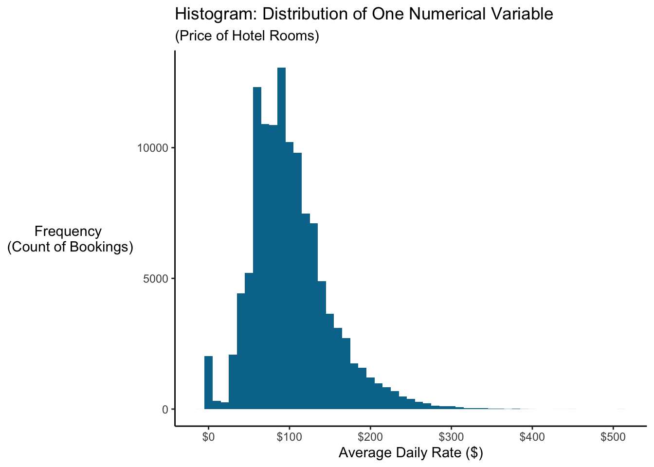
The distribution above shows a peak but is skewed right. (This histogram is a distribution of prices, which makes sense…we see a distribution that looks “normal” but does show a small number of very expensive hotel rooms.) What’s interesting on this histogram? How about that spike at $0? Those are rooms given away for free (complementary) for whatever reason!
One critical decision with histograms is the “bin width” and the number of bins. In ggplot you can either specify bin = n to get n bins (bars) or you can specify binwidth = w to have each bin (bar) cover a range of w. In the example above, I set binwidth = 10 so that each bar covers $10 (ie, prices $0-$10 go in the first bin, $10-$20 in the second, and so on).
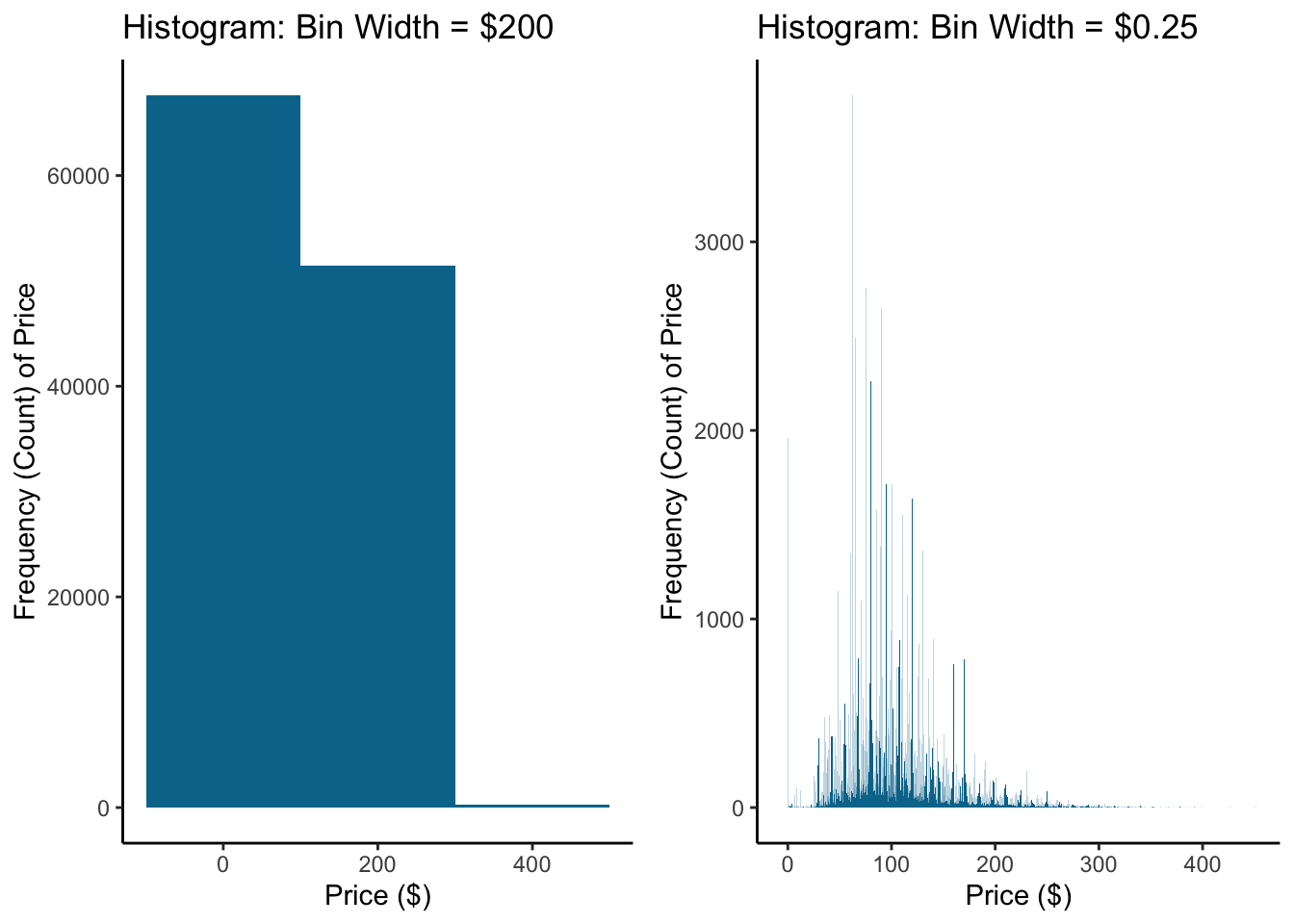
What’s the right number of bins? Imagine we have prices…how many observations do you group together? Should a bin cover a $5 range of prices or $50 range? If you have too many or too few bins, you’ll have a hard time seeing any patterns. Here’s the same histogram as above but with a bin width of $200 and $0.25.
8.2 Density Plot
Density plots are something you’ve seen frequently, though you may not realize it. The common representation of a standard normal distribution is a density plot! It shows the “density” of a variable over its distribution.
Density plots are constructed using a kernel (function) density estimator to estimate the probability of an observation landing at any particular spot on the distribution. You can think of a density plot as a “smoothed” histogram. The figure below on the right shows the same density plot with an overlaid histogram of the same data.
### Create a density plot of the standard normal distribution
# First, construct a dataset of 10000 draws from the standard normal
data <- tibble(x_values = rnorm(10000, mean = 0, sd = 1))

# Create a density plot
densityplot <- data %>%
  ggplot(aes(x = x_values)) +
  geom_density(fill = "#00759a", color = "#ffffff") +
    labs(x = "X",
       y = "Density of X",
       title = addline_format("Density Plot: Distribution of One
                              /Numeric Variable")) +
  theme(axis.line = element_line(color="black"),
        panel.background=element_blank(),
        panel.grid.minor=element_blank(),
        panel.grid.major.y=element_blank(),
        panel.grid.major.x=element_blank(),
        axis.text.x = element_blank(),
        axis.ticks = element_blank(),
        axis.text.y = element_blank())

# Create the density plot but overlay it with a histogram
densityplot_w_histogram <- data %>%
  ggplot(aes(x = x_values)) +
  geom_density(fill = "grey70", color = "#ffffff") +
  geom_histogram(aes(y=..density..), # Plot density instead of count
                 bins = 20,
                 color = "#00759a",
                 alpha = 0.1) +
    labs(x = "X",
       y = "Density of X",
       title = addline_format("Density Plot with/ Histogram Overlay")) +
  theme(axis.line = element_line(color="black"),
        panel.background=element_blank(),
        panel.grid.minor=element_blank(),
        panel.grid.major.y=element_blank(),
        panel.grid.major.x=element_blank(),
        axis.text.x = element_blank(),
        axis.ticks = element_blank(),
        axis.text.y = element_blank())

# Print out both plots next to one another as one figure
grid.arrange(densityplot, densityplot_w_histogram, nrow = 1)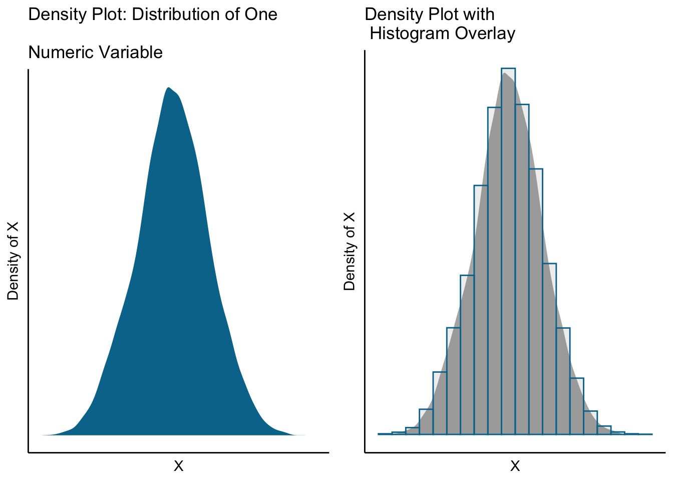
Density plots are particularly useful for comparing distributions (generally better than putting two histograms on the same plot). This allows us to compare the skewness, outliers, and peaks of two different groups.
Let’s look at the distribution of prices charged at the two different hotels (City Hotel and Resort Hotel) in our bookingdata dataset. Are the prices different? We see that the City Hotel charges higher prices to more of it’s customers, but there is a “bigger tail” on the Resort Hotel prices. And we can see that the City Hotel provides more complementary hotel rooms (where price is near $0). Interesting!
bookingdata %>%
  filter(adr < 1000) %>% #Filter out the error(?) of adr = $5400
  ggplot(aes(x = adr, fill = hotel)) +
    geom_density(color = "white",
                 alpha = 0.9) +
    scale_fill_manual(values = c("#00759a", "grey80")) +
    scale_x_continuous(labels = scales::dollar_format()) +
    labs(x = "Average Daily Rate (Price)",
       y = "Density",
       title = addline_format("Density Plot: Average Daily Rate (Price) for Two Hotels"),
       fill = "Hotel") +
  theme(axis.line = element_line(color="black"),
        panel.background=element_blank(),
        panel.grid.minor=element_blank(),
        panel.grid.major.y=element_blank(),
        panel.grid.major.x=element_blank())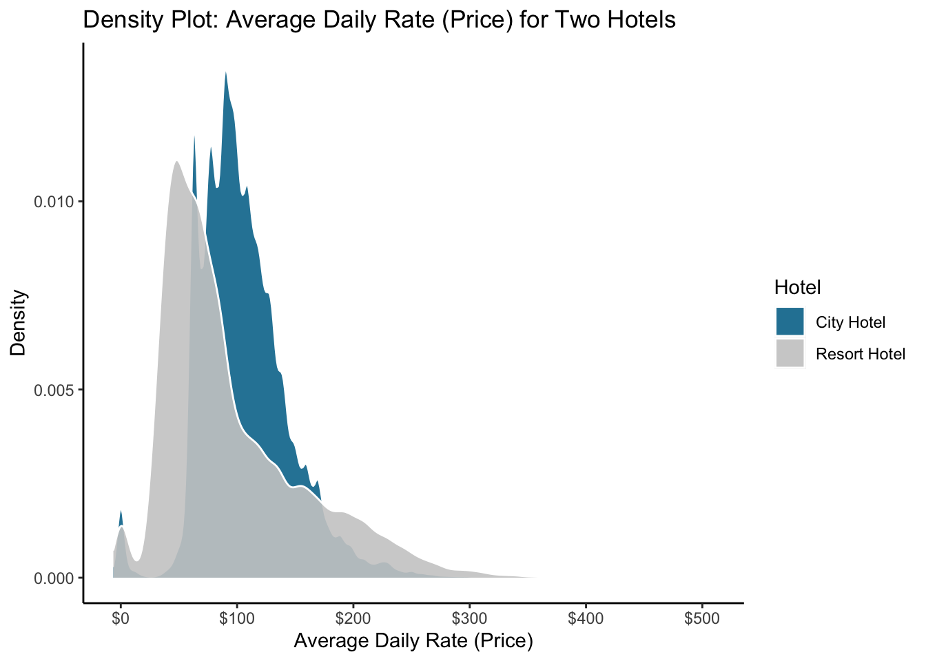
8.3 Box Plot
Box Plots allow you to compare multiple distributions. Let’s look at the anatomy of a boxplot:
Median is the center line (the middle datapoint)
1st Quartile line represents the 25th percentile (25% of the data is below that, 75% is above that)
3rd Quartile line is the 75th percentile
IQR is the range between the 1st and 3rd Quartile
The “whiskers” usually extend 1.5*IQR beyond the box
Points beyond the whiskers are denoted with points/dots and are outliers

Let’s look at a box plot to compare the distribution of the Average Daily Rate (adr) charged at the two hotels.
bookingdata %>%
  filter(adr<1000) %>%
  ggplot(aes(x = hotel, y = adr)) +
  geom_boxplot(color = "black", fill = "#00759a", alpha = 0.8) +
  scale_y_continuous(labels = scales::dollar_format())+
  labs(title = "Boxplot: Compare Distribution One Numeric Variable Across Groups",
       subtitle = "Distribution of Price Between Hotels",
       x = "Hotel",
       y = "Avg Daily Rate ($)")+
  theme(axis.line = element_line(color="black"),
        panel.background=element_blank(),
        panel.grid.minor=element_blank(),
        panel.grid.major.y=element_blank(),
        panel.grid.major.x=element_blank())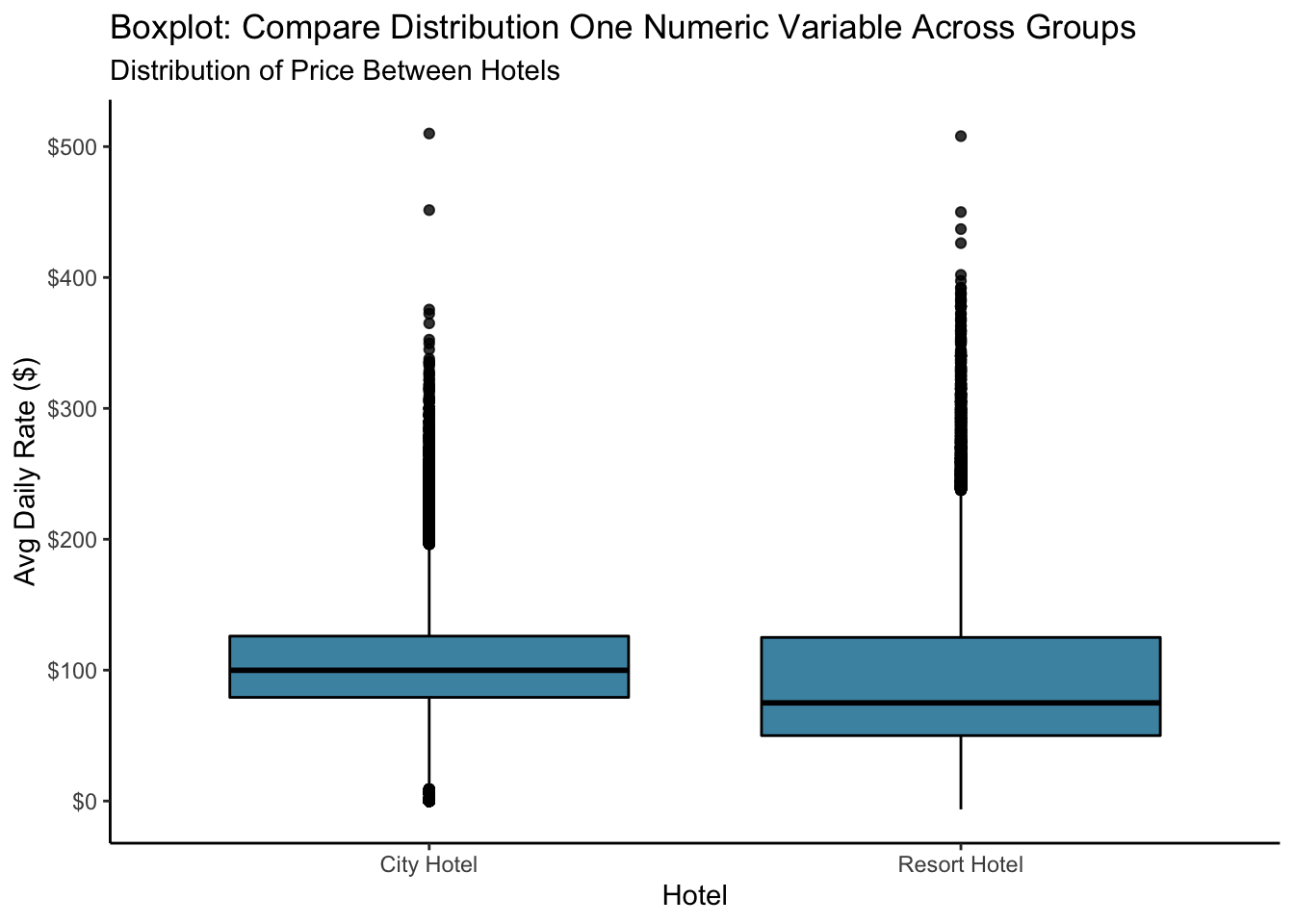
Not bad. They all have their place, but when your dataset has as many outliers as this one does, I think a density plot does a better job.