13 Multivariate Analysis

We often want to evaluate more than just one or two variables at a time. While including too many things can be problematic, there are some visualizations that handle very complex data well.
13.1 Heatmaps
Heatmaps display magnitude as color plotted on a two dimensional grid. In other words, you usually compare three variables:
Categorical OR Numerical variable on the X axis
Categorical OR Numerical variable on the X axis
USUALLY Numerical (potentially ordinal) variable as the fill color
Let’s build a heatmap showing a Numerical Variable (Average Daily Rate or Price) against two Nominal variables (booking channel and room class).
### Build a heatmap showing Average Daily Rate (price in $) by booking channel and room class
booking_data %>%
  ggplot(aes(x = assigned_room_type, y = market_segment, fill = adr)) +
  geom_tile() +
  labs(x = "Room Class",
       y = "Booking Channel",
       fill = "Price ($)",
       title = "Average Daily Rate (Price) by Booking Channel and Room Class") +
  theme_bw() +
  theme(axis.line = element_blank(),
        panel.border = element_blank())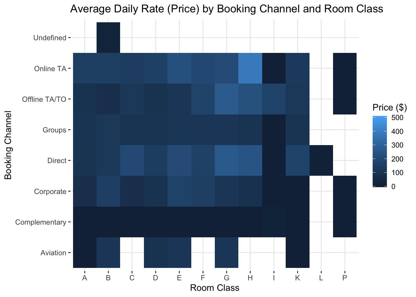
Which room class generates the highest prices on average? And why does the online travel agent (Online TA) generate such higher prices than Offline Travel Agents?
Note that color is not one of the most “precise” preattentive attributes. In other words, it’s harder to compare two colors, especially if they’re right next to each other than, say, the length of a bar chart. Telling the magnitude of the difference is also very difficult. Looking at the figure above, how much higher is the mean price for G class rooms than D class rooms? Your eyes go back to the chart, to the legend, to the chart…hard to tell. A barchart would be easier…
13.2 Parallel Coordinate Plots
Parallel Coordinate Plots allow you compare observations across many dimensions by essentially lining up a series of Y axes. Looking at individual observations isn’t usually too useful, but we are often looking at the trend.
One of the issues is that we often plot many values that have different scales. In the hotel bookings dataset, the highest average daily rate is $510, while the longest stay is 69 days and the highest number of special requests is just 5. One way to deal with this is to normalize the data, by subtracting the mean and dividing by the standard deviation. Another way is to standardize every variable on a scale from 0 to 1.
Let’s look at a parallel coordinates plot with some data from the hotel bookings dataset. Remember that these plots only work well with about 50 observations max, so we have to take a sample (thus we don’t really know how generalizable our insights are).
# Use the ggally package
library(GGally)
## Registered S3 method overwritten by 'GGally':
## method from
## +.gg ggplot2# Create total stay length and party size variables
booking_data <- booking_data %>%
mutate(total_stay_length = stays_in_week_nights + stays_in_weekend_nights,
party_size = adults + children)
# We will sample 50 bookings, so set seed to get same result each time
set.seed(4334)
# Create the parallel coordinates plot
booking_data %>%
select(adr, lead_time, total_stay_length, party_size, is_canceled) %>%
mutate(is_canceled = factor(is_canceled)) %>%
filter(party_size > 0) %>%
sample_n(50) %>%
arrange(is_canceled) %>%
ggparcoord(columns = 1:4,
groupColumn = 5,
showPoints = TRUE,
scale = "center",
alphaLines = 0.6) +
geom_point(position = position_jitter(width = 0.15), alpha = 0.8) +
scale_color_manual(values = c("gray70", "#7a0019")) +
theme_minimal() +
theme(axis.title.y = element_text(angle = 0, vjust = 0.5)) +
labs(color = "Cancellation \nStatus",
x = "Variable",
y = "Standardized \nValue",
title = "Parallel Coordinates Plot by Cancellation Status")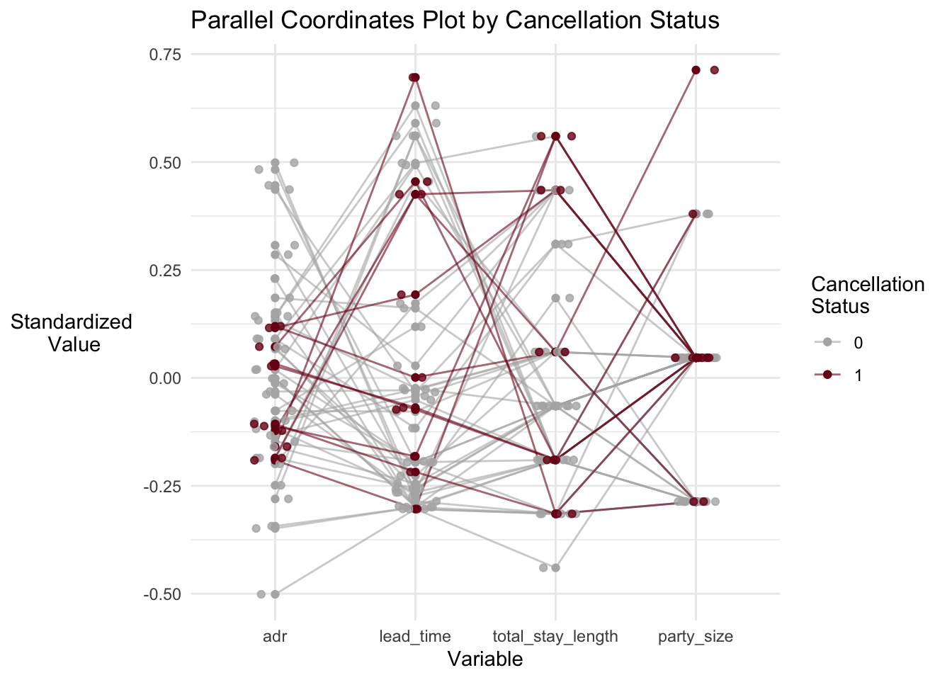
What do we see? Well, most cancellations were from the “middle of the pack” in terms of price (adr). And there does seem to be a cluster that booked fairly low price, short stays far in advance. Maybe these should be targeted for non-refundable deposits.
13.3 Maps and Geographic Plots
Rich datasets often include geographic data. R is capable of producing very nice geographic maps. There are a number of standard spatial formats that have made it much easier to plot geographic in R. That said, it’s often easier in Tableau!
Specialized geographic analysis is probably better performed in a dedicated GIS package like ArcGIS.
### Plot the number of bookings by country
# Load packages
library(sf)
## Linking to GEOS 3.8.1, GDAL 3.1.4, PROJ 6.3.1library(rnaturalearth)
library(rnaturalearthdata)
library(rgeos)## Loading required package: sp## rgeos version: 0.5-5, (SVN revision 640)
## GEOS runtime version: 3.8.1-CAPI-1.13.3
## Linking to sp version: 1.4-2
## Polygon checking: TRUElibrary(ggspatial)
# Load geographic data
world <- ne_countries(scale = "medium", returnclass = "sf")
# Summarize the number of bookings by country
bookings_by_country <- booking_data %>%
group_by(country) %>%
summarize(booking_count = n(),
mean_adr = mean(adr))
# Join the booking data to the geographic data
world <- left_join(world, bookings_by_country, by = c("gu_a3" = "country"))
#
ggplot(data = world) +
geom_sf(aes(fill = booking_count)) +
coord_sf(xlim = c(-25, 30), ylim = c(30, 75), expand = FALSE) +
scale_fill_gradient(na.value = "antiquewhite") +
labs(title = "Bookings by Country",
fill = "Booking Count") +
theme_bw() +
theme(panel.background = element_rect(fill = "aliceblue"))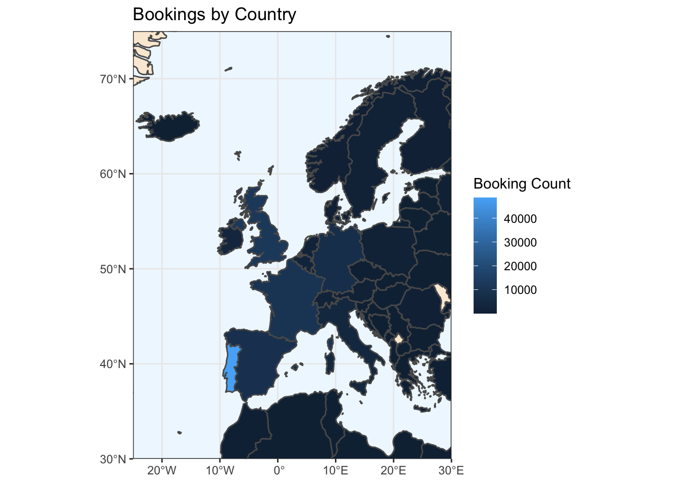
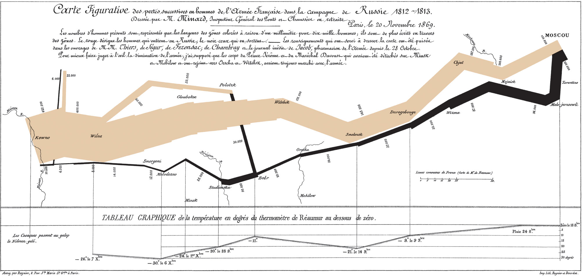
13.4 Sankey Plots
Sankey plots are used to show flows through a network or a series of nodes. Sankey diagrams are named for Captain Matthew Sankey who mapped steam flow through a steam engine in a famous 1898 diagram, though they were in use before that. Perhaps the most famous diagram of this type was drawn in 1869 by Charles Minard and depicts Napoleon Bonaparte’s invasion to (and subsequent retreat from) Moscow. The width of the lines shows the strength (number of troops) in the army; tan lines represent advance and black lines represent retreat. The line graph on the bottom represents the temperature.
Sankey diagrams are useful for helping to understand flows and connections. For example, we could use it to model a customer conversion funnel:
# Load package
library(networkD3)
library(htmlwidgets)
library(htmltools)

# Create fake dataset showing customers through the conversion funnel
nodes <- tibble(names = c("Prospects", "Contacted", "Meeting", "Quote", "Sale", "Lost"))
links <- tibble(source = c(0, 0, 1, 1, 2, 2, 3, 3),
                target = c(1, 5, 2, 5, 3, 5, 4, 5),
                value = c(80, 20, 30, 50, 10, 20, 5, 5))

# Create plot
sankey <- sankeyNetwork(Links = links, Nodes = nodes, Source = 'source',
              Target = 'target', Value = 'value', NodeID = 'names',
              fontSize = 12,
              nodeWidth = 30, iterations = 0)

# Add title
sankey <- htmlwidgets::prependContent(sankey, htmltools::tags$h4("Sales Funnel"))

# Display the plot
sankey
Sales Funnel
Or, we could look at our hotelbookings data. The dataset contains two variables related to the type/class of room people book, reserved_room_type and assigned_room_type. It looks like there are a lot of people in “A” rooms who get bumped up to “D” rooms!
# Create the list of nodes
sankey_booking_data <- booking_data %>%
  filter(reservation_status == "Check-Out") %>%
  select(reserved_room_type, assigned_room_type) %>%
  group_by(reserved_room_type, assigned_room_type) %>%
  summarise(value = n()) %>%
  ungroup() %>%
  mutate(source = paste0(reserved_room_type, " Reserved"),
         target = paste0(assigned_room_type, " Assigned"))

sankey_nodes <- tibble(names = unique(sankey_booking_data$source)) %>%
  add_row(names = unique(sankey_booking_data$target))

sankey_booking_data <- sankey_booking_data %>%
  mutate(source = as.numeric(factor(reserved_room_type))-1, target = as.numeric(factor(assigned_room_type)) + 8)

# Create the plot
sankey <- sankeyNetwork(Links = sankey_booking_data, Nodes = sankey_nodes, Source = 'source',
              Target = 'target', Value = 'value', NodeID = 'names',
              units = "Rooms", fontSize = 12,
              nodeWidth = 30, iterations = 0)
# Add title
sankey <- htmlwidgets::prependContent(sankey, htmltools::tags$h4("Room Reservation vs Assignment"))

# Display plot
sankey