15 Accessible Design

Generally, you should want to communicate to the widest possible audience. After all, if you’re saying something, don’t you want everyone to be able to get that information? Additionally, many organizations (e.g. government agencies) are required to provide information in an accessible format. The Web Content Accessibility Guidelines are probably the “core” of accessibility guidelines for web content (and many other guidelines or requirements are based on these).
We can take some basic steps to improve the accessibility of our data visualizations, particularly if they will be web-based.
15.1 Include a Summary
One best practice is to include a brief caption that describes what the visualization shows, and any key trends or takeaways. As with the discussion about good use of color, this description can benefit all readers regardless of how they interact with your content. Additionally, this description can help search engines better index your content. Everybody wins. There’s really no downside here!
booking_data %>%
  filter(is_canceled == 0) %>%
  mutate(revenue = adr * (stays_in_weekend_nights + stays_in_week_nights)) %>%
  group_by(hotel, arrival_date_year) %>%
  summarize(annual_revenue = sum(revenue)) %>%
  ggplot(aes(x = arrival_date_year, y = annual_revenue, fill = hotel)) +
  geom_bar(stat = "identity", width = 0.8, position = position_dodge2()) +
  stat_summary(aes(y = annual_revenue + 500000, label = dollar(round(..y..,0))), fun = "identity",
               geom = "text",
               hjust = 0.5, angle = 0, size = 3,
              position = position_dodge(width = .9)) +
  scale_fill_manual(values = c("#7a0019", "#00759a")) +
  labs(x = "",
       y = "",
       title = "Revenue Contribution by Hotel (2015-2017)",
       fill = "") +
  theme(axis.line.y = element_blank(),
        axis.line.x = element_line(color = "gray40"),
        axis.text.y = element_blank(),
        axis.ticks = element_blank(),
        plot.background = element_blank(),
        panel.background = element_blank(),
        panel.grid = element_blank(),
        plot.title = element_text(hjust = 0.5),
        legend.position = "bottom")
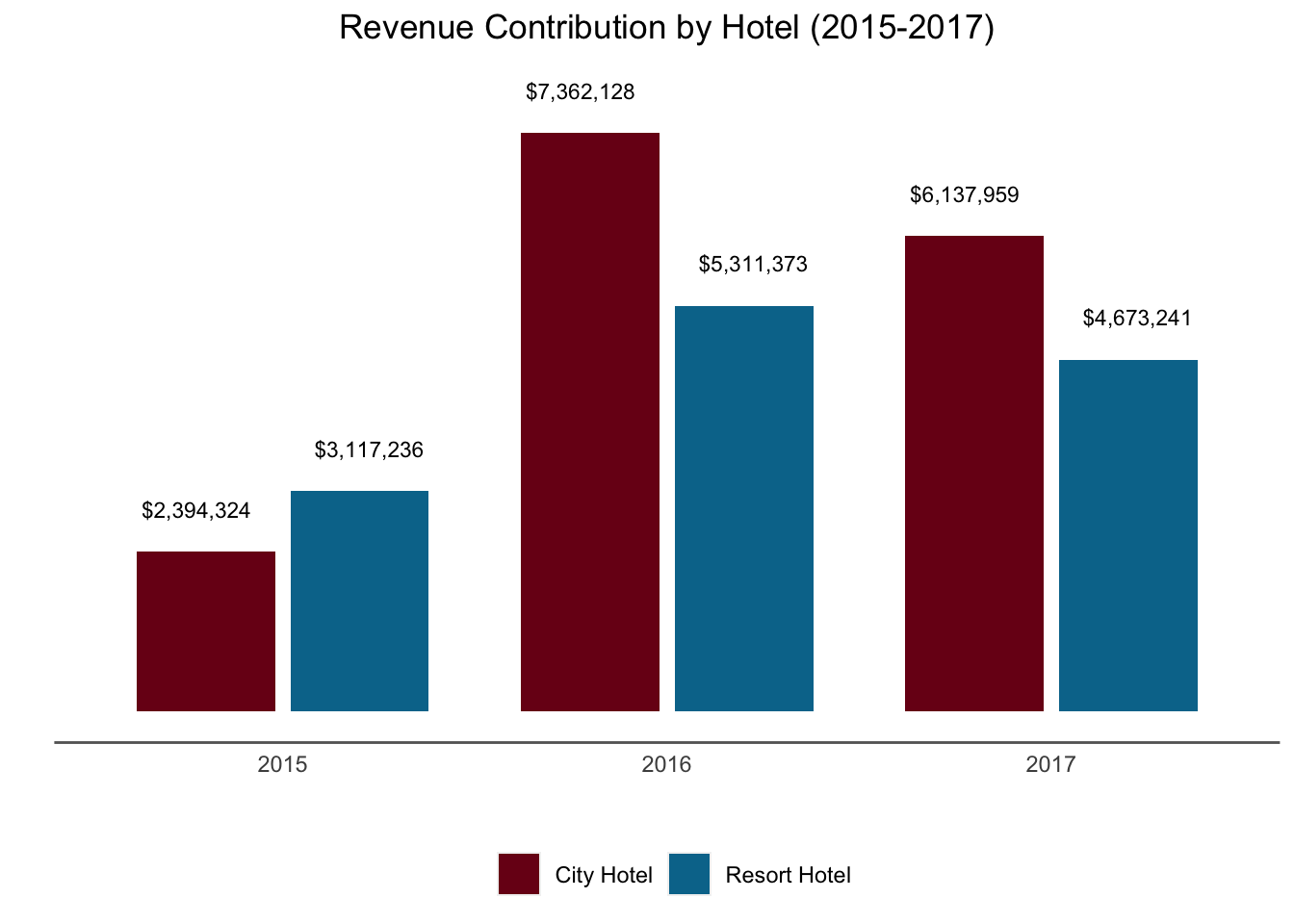
(#fig:summary_access_design)Summary: Both the City and Resort Hotel have demonstrated revenue growth, but the City Hotel has grown much more. While revenue was similar in 2015, in 2016 and 2017, the City Revenue brought in far more revenue than the Resort Hotel
15.2 Clearly Label Data
Clearly label the data when possible. For example, labeled values on bar graphs are one effective tool (but make sure the user knows what each label corresponds to).
When not possible (e.g. with a line graph), a data table can be a good supplemental option.
15.3 Supporting Screen Readers (e.g. VoiceOver)
Many people interact with web-based content via a screen reader. There are tools available (like scalable vector graphics or SVGs) that allow you to include much more detail than you show in the image. For example, you can add hidden labels which will allow the screenreader to “read” more than somebody looking at the image would see.
15.3.1 Careful with Interactions
In this class, we’ve highlighted the role of interactions, but if all of the content is “hidden” behind interactions (such as tooltips that only appear on hovering) screen readers won’t be able to access them.