12 Parts-To-Whole Analysis

12.1 Why no pie?
Pie charts are very popular but have fallen out of favor with many data visualization enthusiasts. I’m not quite that fanatical. Still, pie graphs are rarely the best way to display information. Part of the issue is that it’s not particularly easy to compare angular sections, or to tell estimate the magnitude of the difference between circular areas.
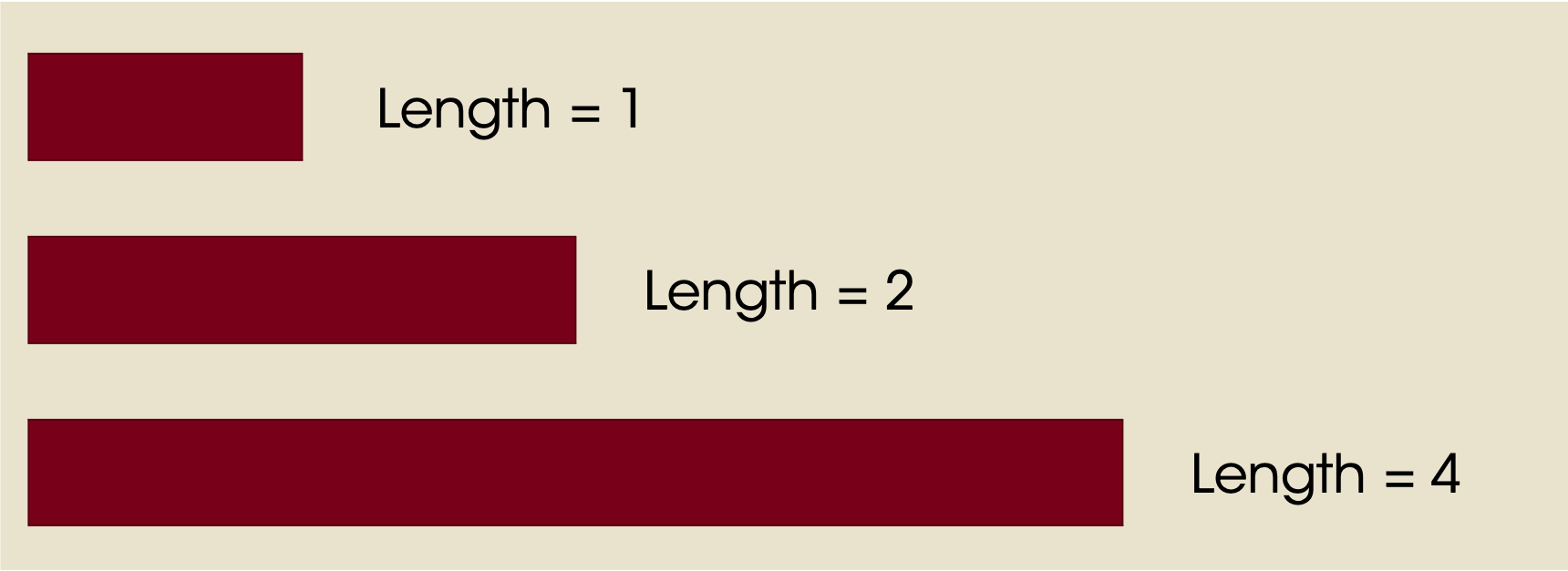
Look at the example below. The circle on the left has an area of 1 unit, the middle circle 2 units, and the right circle 4 units. Is that intuitive and easy to see? For most readers, probably not.
![]()
Compare this to these line lengths. It’s much easier to estimate the magnitude of the difference.
This means that most readers will have an easier time interpreting a bar graph than a pie graph. This is especially true when you want to find trends. Let’s look at a quick example.
Suppose your firm emails every customer a discount, randomly assigning customers to receive a coupon percentage (to save 10%, 12%, 15%, or 18% off their order). You want to see how customers respond, so you make a pie graph of the number of customers who make a purchase.
There are two possible scenarios below. In the left scenario, higher discounts yield more customers responding and making a purchase. In the right scenario, it’s basically random (no trend).
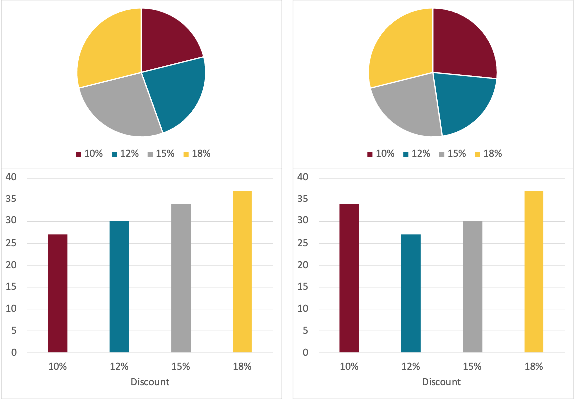
The example above shows two common issues with pie graphs.
It can be difficult to tell two pie graphs apart. How different are they?
It’s difficult to interpret trends. Yes, you could do it, starting at the 10% segment and moving clockwise…but the bar graph is almost always easier.
12.2 Bar Charts
Bar charts are a very effective way to present a parts-to-whole analysis. Let’s look at the revenue contribution of two hotels by year. This is a “grouped” bar chart…for each year we have two bars.
booking_data %>%
  mutate(revenue = adr * (stays_in_weekend_nights + stays_in_week_nights)) %>%
  group_by(hotel, arrival_date_year) %>%
  summarize(annual_revenue = sum(revenue)) %>%
  ggplot(aes(x = arrival_date_year, y = annual_revenue, fill = hotel)) +
  geom_bar(stat = "identity", width = 0.8, position = position_dodge2()) +
  stat_summary(aes(y = annual_revenue + 500000, label = dollar(round(..y..,0))), fun = "identity",
               geom = "text",
               hjust = 0.5, angle = 0, size = 3,
              position = position_dodge(width = .9)) +
  scale_fill_manual(values = c("#7a0019", "#00759a")) +
  labs(x = "",
       y = "",
       title = "Revenue Contribution by Hotel (2015-2017)",
       fill = "") +
  theme(axis.line.y = element_blank(),
        axis.line.x = element_line(color = "gray40"),
        axis.text.y = element_blank(),
        axis.ticks = element_blank(),
        plot.background = element_blank(),
        panel.background = element_blank(),
        panel.grid = element_blank(),
        plot.title = element_text(hjust = 0.5),
        legend.position = "bottom")
12.2.1 To Stack or Not to Stack?
The chart above was “grouped” or unstacked. Each bar started at 0. Let’s look at the same chart as above, but “stack it”. Also, let’s make it a bit easier to read by putting the units in millions of dollars. This one also has white lines to break up every $5M segment. I’m not always a fan of the lines but they can be helpful.
booking_data %>%
  mutate(revenue = adr * (stays_in_weekend_nights + stays_in_week_nights)) %>%
  group_by(hotel, arrival_date_year) %>%
  summarize(annual_revenue = sum(revenue) /1000000) %>%
  ggplot(aes(x = arrival_date_year, y = annual_revenue, fill = hotel)) +
  geom_bar(stat = "identity", width = 0.8) +
  geom_hline(aes(yintercept = 5), color = "white") +
  geom_hline(aes(yintercept = 10), color = "white") +
  geom_hline(aes(yintercept = 15), color = "white") +
  scale_fill_manual(values = c("#7a0019", "#00759a")) +
  scale_x_continuous(breaks = c(2015, 2016, 2017)) +
  scale_y_continuous(labels = scales::dollar_format(prefix="$", suffix = "M")) +
  labs(x = "",
       y = "",
       title = "Total Revenue 2015-2017",
       fill = "") +
  theme(axis.line = element_line(color = "gray40"),
        axis.ticks.x = element_blank(),
        plot.background = element_blank(),
        panel.background = element_blank(),
        panel.grid = element_blank(),
        plot.title = element_text(hjust = 0.5),
        legend.position = "bottom")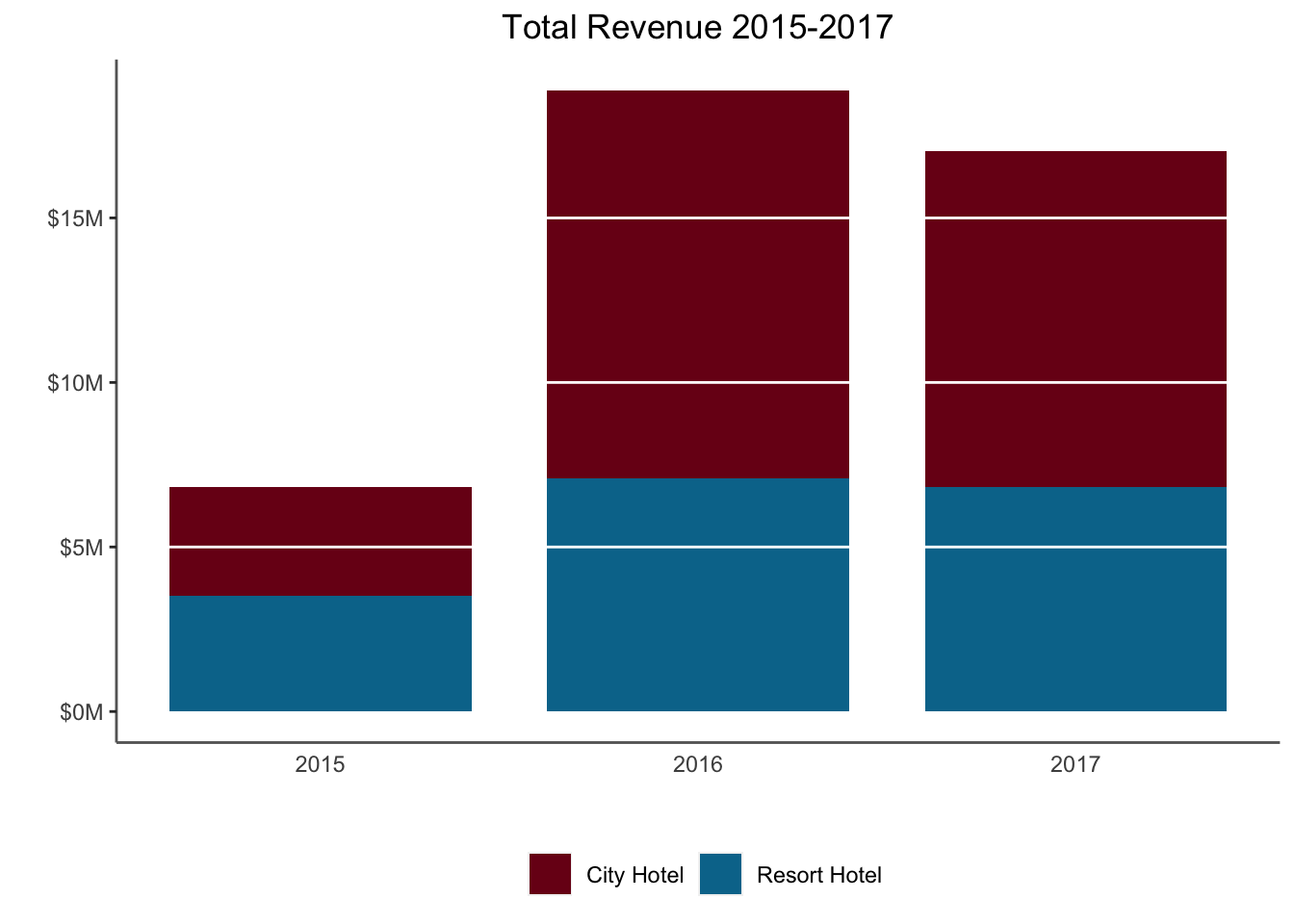
So when should you stack bars? When you’re more interested in the total amount, you should stack the bars. When you’re more interested in comparing the contribution of different components, you should unstack them. Both have their place.
Why did bookings go down in 2017 compared to 2016? (Hint: What dates does the dataset span?)
12.2.2 Waterfall Charts
A variation on the stacked bar chart is the waterfall chart which is used to show the impact of introducing a series of positive and negative values. Let’s look at a “toy example” of Profit and Loss.
We have a series of revenues and then expenses, and want to see how we arrive at our Net.
waterfall_data <- tibble(id = c(1, 2, 3, 4, 5, 6, 7),
                         description = c("Gross Revenue", "Other Income", "COGS",
                                         "Sales", "Overhead", "Taxes", "Net"),
                         amount = c(1.2, 0.2, -0.6, -0.05, -0.1, -0.3, 0.35),
                         type = c("in",  "in", "out", "out", "out", "out", "net"))
waterfall_data$end <- cumsum(waterfall_data$amount)
waterfall_data$end <- c(head(waterfall_data$end, -1), 0)
waterfall_data$start <- c(0, head(waterfall_data$end, -1))
waterfall_data$description <- as.factor(waterfall_data$description)
waterfall_data <- waterfall_data %>% rowwise() %>% mutate(label_y = max(start, end) + 0.05)

waterfall_data %>%
  ggplot(aes(fill = type)) +
  geom_rect(aes(xmin = id - 0.45, xmax = id + 0.45, ymin = end, ymax = start)) +
  scale_fill_manual(values = c("in" = "#58a618", "out" = "#7a0019", "net" = "#00759a")) +
  scale_x_continuous(breaks = c(1, 2, 3, 4, 5, 6,7),
                     labels = c(as.character(waterfall_data$description))) +
  geom_text(aes(x = id,
                y = label_y,
                label = paste0("$", amount, "M"))) +
  labs(x = "Revenue/Expense Type",
       y = "",
       fill = "Flow",
       title = "P&L Waterfall Chart Example") +
    theme(axis.line.x = element_line(color = "gray40"),
          axis.line.y = element_blank(),
          axis.ticks = element_blank(),
          axis.text.y = element_blank(),
          plot.background = element_blank(),
          panel.background = element_blank(),
          panel.grid = element_blank(),
          plot.title = element_text(hjust = 0.5),
          legend.position = "right")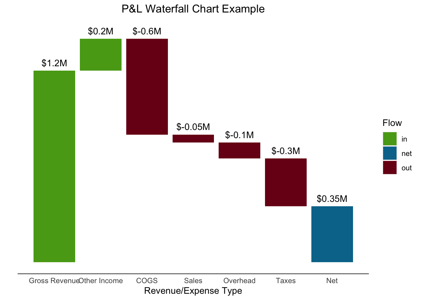
12.3 Area Plot
An area plot is similar to a stacked bar chart, but is helpful for displaying information over time at smaller scale (e.g. days or months instead of years) and is helpful if you have many time points.
# Line graph with bookings by month
booking_data %>%               # Take the booking data
  group_by(hotel, arrival_date_year, arrival_date_month) %>%  # Group observations hotel & month-year
  summarise(Stays = n()) %>%           # Count number of bookings
  mutate(booking_date = dmy(paste0("01", arrival_date_month, arrival_date_year))) %>%
  ggplot(aes(x = booking_date, y = Stays, fill = hotel)) +
    geom_area() +
    scale_fill_manual(values = c("#7a0019", "#00759a")) +
    scale_x_date(labels = date_format("%b"),
                 breaks = date_breaks("3 months")) +
    scale_y_continuous(labels = scales::comma_format()) +
    labs(x="",
         y = "Total Bookings",
         title="Number of Bookings") +
    theme(legend.position = "none",  # Hide legend
          plot.title = element_text(hjust=0.5, face="bold"),
          panel.background=element_blank(),
          panel.grid.minor=element_blank(),
          panel.grid.major.y=element_blank(),
          panel.grid.major.x=element_line(),
          axis.line = element_line(color = "gray40")) +
      geom_text(aes(x = as.Date("2017-03-01"), y = 2100, label = "City Hotel"),
              color = "white", hjust = 0, check_overlap = TRUE) +
    geom_text(aes(x = as.Date("2017-03-01"), y = 1200, label = "Resort Hotel"),
              color = "white", hjust = 0, check_overlap = TRUE) +
    geom_vline(aes(xintercept = as.Date("2016-01-01")), color = "white", check_overlap = TRUE) +
    geom_vline(aes(xintercept = as.Date("2017-01-01")), color = "white", check_overlap = TRUE) +
    geom_text(aes(x = as.Date("2015-08-01"), y = 200, label = "2015"),
              color = "white", hjust = 0, check_overlap = TRUE) +
    geom_text(aes(x = as.Date("2016-01-15"), y = 200, label = "2016"),
              color = "white", hjust = 0, check_overlap = TRUE) +
    geom_text(aes(x = as.Date("2017-01-15"), y = 200, label = "2017"),
              color = "white", hjust = 0, check_overlap = TRUE)
## Warning: Ignoring unknown parameters: check_overlap
## Warning: Ignoring unknown parameters: check_overlap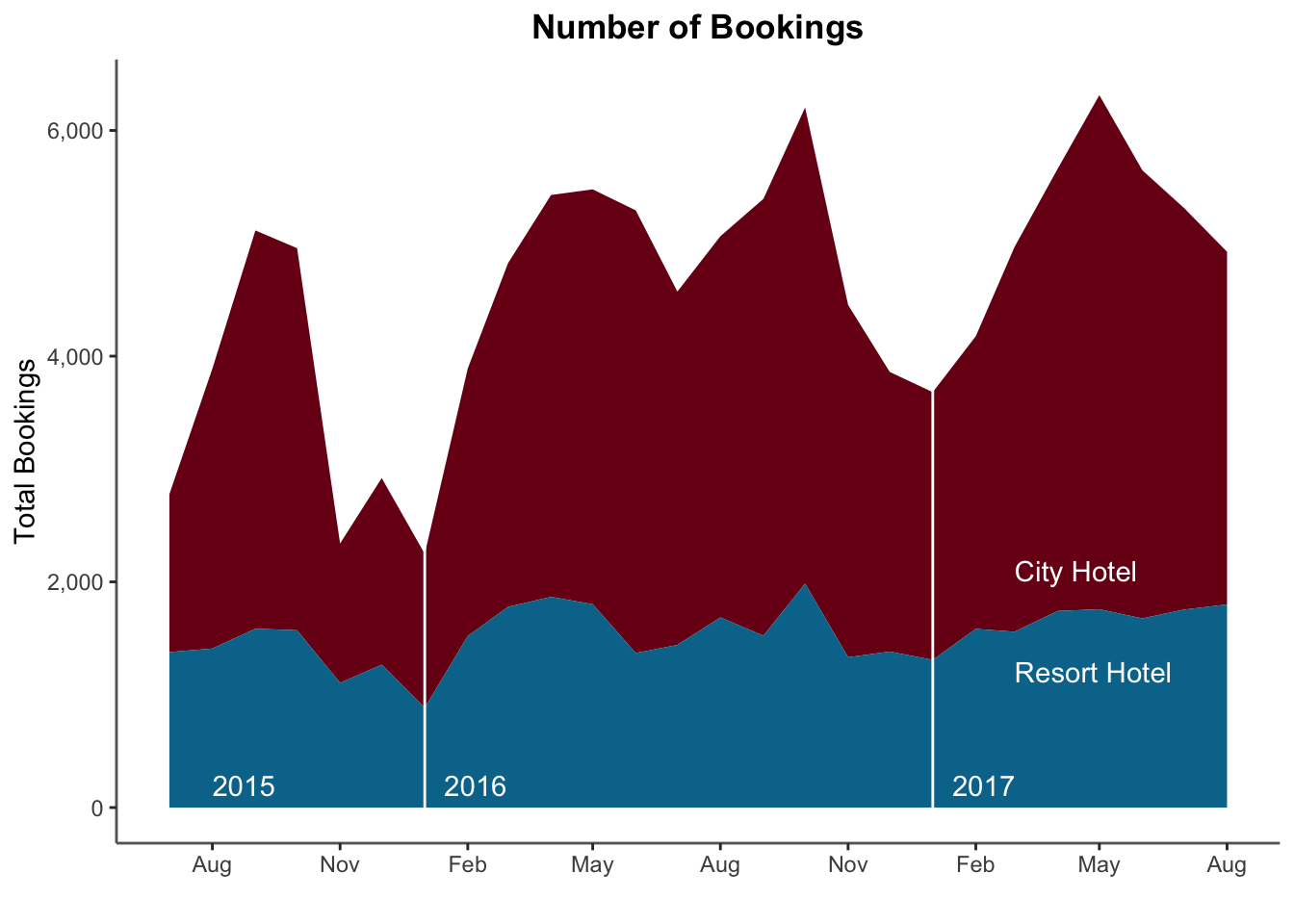
12.4 Mosaic Plots
The Mosaic Plot or “Marimekko Plot” is useful for comparing two categorical variables. The package ggmosaic can be used to create these plots.
### Create a Mosaic Plot
# Compare cancellations and deposit

# Load the ggmosaic package; this adds a geom_mosaic to ggplot
#remotes::install_github('haleyjeppson/ggmosaic' )
library(ggmosaic)

# Create a mosaic plot
booking_data %>%
  #filter(is_canceled == 0) %>%
  mutate(cancellation = ifelse(is_canceled == 1, "Cancelled", "Not Cancelled")) %>%
  ggplot() +
  geom_mosaic(aes(x = product(deposit_type, cancellation),
                  fill = deposit_type)) +
  scale_fill_manual(values = c("#7a0019", "#00759a", "#ffcc33")) +
  labs(x = "Cancellation Status",
       y = "",
       title = "No Deposit is Collected for Most Cancellations",
       fill = "") +
  theme(axis.title.y = element_text(angle = 0, vjust = 0.5),
        plot.background = element_blank(),
        panel.background = element_blank(),
        panel.grid = element_blank(),
        plot.title = element_text(hjust = 0.5))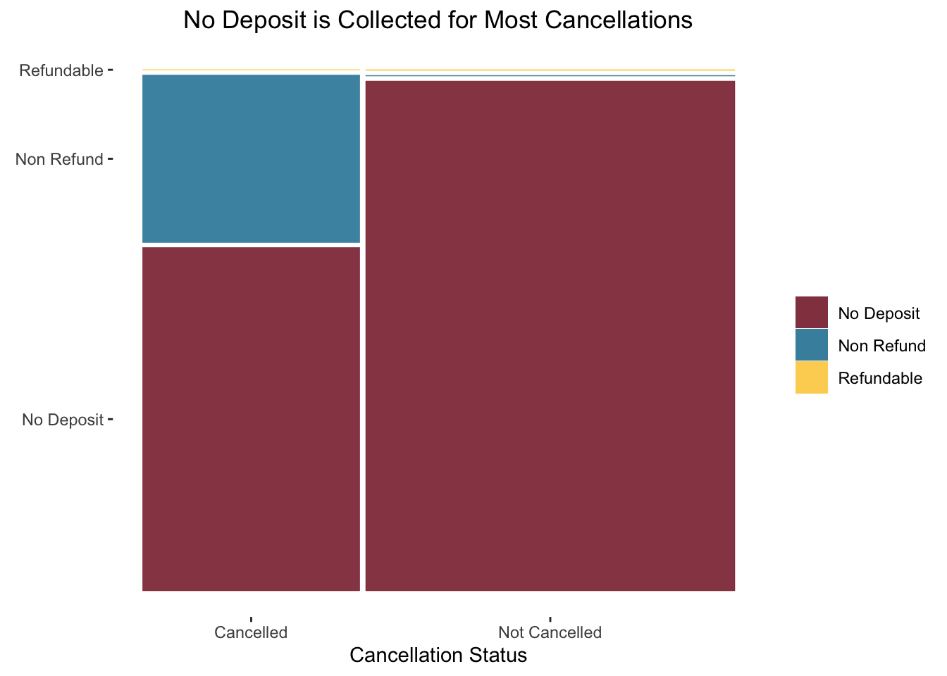
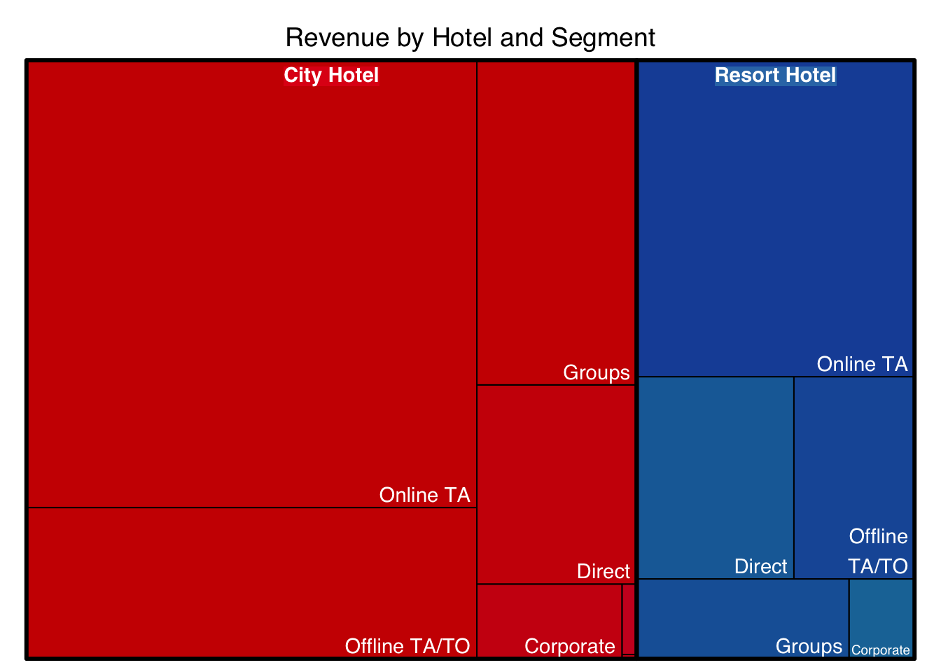
12.5 Tree Map
A treemap plots the area in a similar way to a Marimekko Plot, but does not place the same restrictions on dimensions. These work well in interactive dashboards.
# Load library
library(treemap)

# Summarize the data
treemapdata <- booking_data %>%
  mutate(revenue = adr * sum(stays_in_weekend_nights, stays_in_week_nights)) %>%
  group_by(hotel, market_segment) %>%
  summarize(total_revenue = sum(revenue))

# basic treemap
p <- treemap(treemapdata,
            index=c("hotel","market_segment"),
            vSize="total_revenue",
            type="index",
            title = "Revenue by Hotel and Segment",
            palette = "Set1",
            #bg.labels=c("white"),
            align.labels=list(
              c("center", "top"),
              c("right", "bottom")
            )
          )